Equal Height CSS Columns in Bootstrap
Achieving equal height columns without resorting to tables has long plagued web designers. Unlike table columns, CSS divs don't communicate with each other. Unless you use same sized images and content, all symmetry is lost.
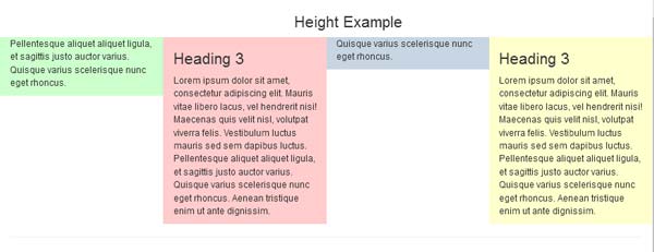
While there is no such thing as equal height CSS columns, we sometimes need to trick the eye into thinking they are equal without doing collateral damage to our final product.
Enter Responsive Web Design and the challenge is even greater. The workarounds we relied upon in old fashioned, fixed-width layouts like Faux Columns with a repeating background image will not work in Fluid or % width layouts.
Fear not, there is a fix and it's a relatively painless workaround for Bootstrap 3.x. Feel free to use the latest Bootstrap version if you wish. To begin, we need a basic Bootstrap layout. For this tutorial, I'm using 2-cols on small devices and 4-cols on medium devices.
HTML Code
<!doctype html>
<html>
<head>
<meta charset="utf-8">
<title>Bootstrap Starter Page</title>
<meta name="viewport" content="width=device-width, initial-scale=1">
<meta http-equiv="X-UA-Compatible" content="IE=edge">
<!--[if lt IE 9]>
<script src="http://html5shiv.googlecode.com/svn/trunk/html5.js"></script> <![endif]-->
<!--Bootstrap-->
<link rel="stylesheet" href="http://maxcdn.bootstrapcdn.com/bootstrap/3.3.6/css/bootstrap.min.css">
></head>
<body class="container-fluid">

<h3 class="text-center">Equal Height Example</h3>
<div class="row sameheight">
<div class="col-sm-6 col-md-3 equal">
<p>Pellentesque aliquet aliquet ligula, et sagittis justo auctor varius. Quisque varius scelerisque nunc eget rhoncus.</p>
</div>
<div class="col-sm-6 col-md-3 equal">
<h3>Heading 3</h3>
<p>Lorem ipsum dolor sit amet, consectetur adipiscing elit.  Mauris vitae libero lacus, vel hendrerit nisi!  Maecenas quis velit nisl, volutpat viverra felis. Vestibulum luctus mauris sed sem dapibus luctus.  Pellentesque aliquet aliquet ligula, et sagittis justo auctor varius. Quisque varius scelerisque nunc eget rhoncus.  Aenean tristique enim ut ante dignissim. </p>
</div>
<div class="col-sm-6 col-md-3 equal">
<p>Quisque varius scelerisque nunc eget rhoncus. </p>
</div>
<div class="col-sm-6 col-md-3 equal">
<h3>Heading 3</h3> <p>Lorem ipsum dolor sit amet, consectetur adipiscing elit.  Mauris vitae libero lacus, vel hendrerit nisi!  Maecenas quis velit nisl, volutpat viverra felis. Vestibulum luctus mauris sed sem dapibus luctus.  Pellentesque aliquet aliquet ligula, et sagittis justo auctor varius. Quisque varius scelerisque nunc eget rhoncus.  Aenean tristique enim ut ante dignissim. </p>
</div>
<!--end row--></div>

<!--latest jQuery-->
<script src="https://code.jquery.com/jquery-1.12.2.min.js" integrity="sha256-lZFHibXzMHo3GGeehn1hudTAP3Sc0uKXBXAzHX1sjtk=" crossorigin="anonymous"></script>

<!--Bootstrap-->
<script src="http://maxcdn.bootstrapcdn.com/bootstrap/3.3.6/js/bootstrap.min.js"></script>
</body>
</html>
CSS Code
Add this to your custom stylesheet.
.sameheight { overflow: hidden; }

.equal {
   margin-bottom: -99999px;
   padding-bottom: 99999px;
}

/**optional alternating background-colors**/
div.equal:nth-of-type(1) { background: #CFC;}
div.equal:nth-of-type(2) { background: #FCC;}
div.equal:nth-of-type(3) { background: #C7D5E3;}
div.equal:nth-of-type(4) { background: #FFC;}
Results
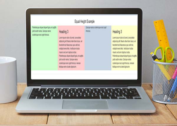
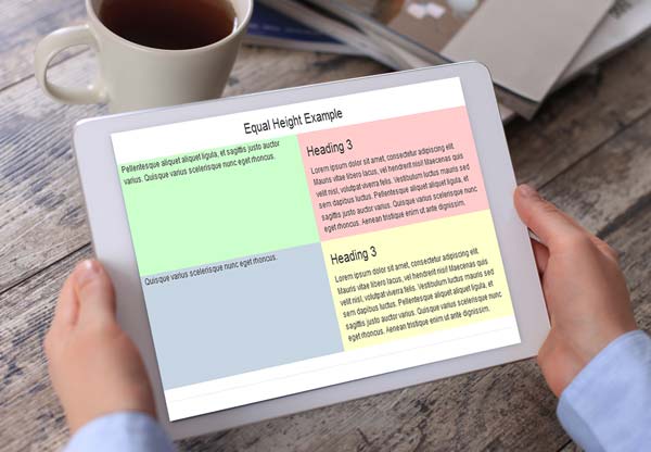
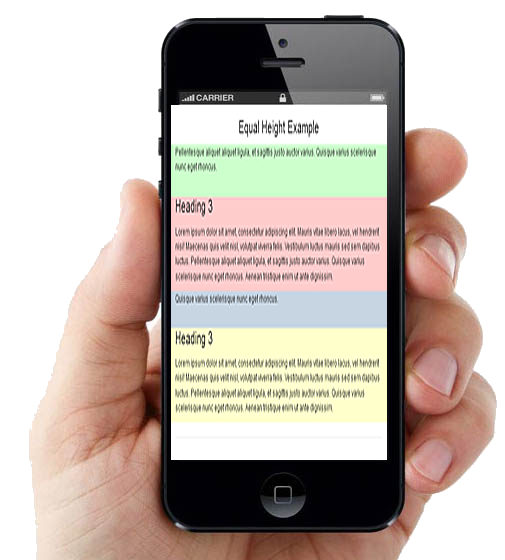
That's all there is to it. Hope you enjoyed this brief tutorial.